CUM ALEGEM CULOAREA POTRIVITA DE CORECTOR PENTRU A ACOPERI DIVERSE PROBLEME ALE TENULUI ?
* Culoarea alba: Acest corector este utilizat pentru a lumina zonele intunecate
ale pielii, cu toate acestea, se foloseste pentru a masca problemele
pielii foarte deschise la culoare, pentru care oricare nuante de bej ar
fi prea inchise. Poate fi, utilizat deasemenea ca si un iluminator in
corectia formei fetei (crearea ovalului) pentru a sublinia si a scoate
in evidenta o anumita zona.
* Culoarea violet-roza (lavanda):
Aceasta culoare neutralizeaza galbenul si verdele si de aceea se
recomanda in principal pentru toate tipurile de ten cu o nuanta de
galben nesanatos. Deasemenea acest corector acopera perfect vanataile in
curs de tratare sau se mai foloseste pentru a acoperi urmele
operatiilor plastice (mici pete de nuanta galben si verde). Expresia:
“esti palid” se refera la nuanta nesanatoasa de galben a tenului. Cu o
corectie corecta si o pudra speciala putem reda tenului aspectul de
proaspat-sanatos.
* Culoarea violet (mov cu albastru): pentru
petele pigmentate mari, create, de exemplu de un autobranzand aplicat
prost. Ele se curata foarte greu, dar nici pe fata nu-si doreste sa le
vada nimeni – se pot corecta / acoperi cu aceasta nuanta de corector
mov-violet.
* Corector verde: aici lucrurile sunt mai clare, s-a
scris foarte mult despre utilizarea lui si probabil sunt foarte putini
cei care nu stiu ca verdele acopera roseata. Acest corector se foloseste
pentru acoperirea cicatricilor/urmelor de acnee. Deasemenea cu aceasta
nuanta pot fi corectate cicatricile proaspete dupa un bronz agresiv,
capilare sparte. Corectorul verde se foloseste dupa un peeling chimic
sau cu laser, cand tenul capata o nuanta roz-inrosita.
* Corector
de nuata portocaliu/orange (mai mult rosu, decat galben): pentru pielea
palida si obosita. Regleaza nuanta galben-maslinie a tenului. Se
utilizeaza pentru a lumina si a reda tonului natural al fetei –
prospetime si viata.
* Corector portocaliu (cu mai mult galben decat rosu): inlatura cearcanele, venele si petele inchise a tenului
* Corector de culoare galbena: inlatura petele de nuante mov-violet
(vanat) de sub ochi. Aduce un plus de caldura in aspectul tenului.
* Nuanta bej a corectorului: improspateaza si invie nuanta generala a
tenului, acopera problemele ramase a pielii corectand si uniformizand
deasupra ceea ce am corectat inainte, atfel spus – uniformizam toata
etapa corectiei. De exemplu: dupa ce am corectat cearcanele puternice cu
nuanta potrivita, iar peste venim cu bej.
https://www.facebook.com/photo.php?fbid=469092079820604&set=a.449663641763448.107230.159652297431252&type=1
Se afișează postările cu eticheta Utile. Afișați toate postările
Se afișează postările cu eticheta Utile. Afișați toate postările
sâmbătă, 26 ianuarie 2013
vineri, 7 septembrie 2012
10 Shapes for Your Eyeshadow - Sfaturi pentru aplicarea fardului
Maybe it’s just one shadow applied to whole lid, maybe two shadows mixed together from the middle of the lid, or something similar.
I decided to make this post to give you some ideas of how to use you darker shadows differently!
Highlights:

Makeup is after all just play with lights and shadows, and to use lighter shades to bring certain
spots up more than others, and other points are made darker, so that they look like they’re deeper.
My highlight spots are in the inner corner of the eye, in the middle of the lid, and on the brow bone.

Different eyeshadow shapes:
There are countless ways how you can use your shadows, by mixing different colors, different textures,
and glitters, but here’s some ideas were to apply your makeup’s darkest shade:
Inner corner:

You can add darker shadow only to inner corner of your lid, which seems reduce the space between the eyes.

Outer corner:

I have used this often, even though I don’t think I have close-set eyes, so I think this suits for other eye
types too.

Both corners:

colors, and with natural everyday looks with neutral colors. It doesn’t make
eyes look wider or smaller, and I think it suits for all eye types.

Outer corner, “catshape”:

are bit droopy, this might bring them the “boost” they need.

Outer corner & crease, blended upwards:

Darker shadow is applied to outer corner and crease, then blended up towards the brow, where it
meets the highlighter, and blends together with it.
This is also good technique if you have hooded eyes, just extend the shadows so that they show up a bit.

Banana:


Whole inner part:

But you might want to try it, maybe with lighter colors.

Just crease:

eyes look more deeper. If you add some light color to your lid, your lid looks bigger.

Whole lid:

Be careful if you use bright colors, especially if you don’t want to draw too much attention to your eyes.

____
Please remember, that everyone has different eye shape, head shape, nose shape, and that all affects one way or the other to the makeup.
So don’t get depressed if some makeup style doesn’t fit you, just move on to the next style. Eventually you’ll find your own!
SURSA
marți, 4 septembrie 2012
Harta Tenului
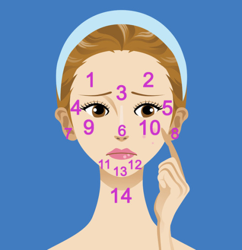
What is your acne telling you?
1 & 2: Digestive System — Eat less processed or junk food, reduce the amount of fat in your diet, step up water intake and opt for cooling things like cucumbers.
3: Liver — Cut out the alcohol, greasy food and dairy. This is the zone where food allergies also show up first, so take a look at your ingredients. Besides all this, do 30 minutes of light exercise every day and get adequate sleep so your liver can rest.
4 & 5: Kidneys — Anything around the eyes (including dark circles) point to dehydration. Drink up!
6: Heart — Check your blood pressure (mine was slightly high) and Vitamin B levels. Decrease the intake of spicy or pungent food, cut down on meat and get more fresh air. Besides this, look into ways to lower cholesterol, like replacing “bad fats” with “good fats” such as Omegas 3 and 6 found in nuts, avocados, fish and flax seed. Also, since this area is chock-full of dilated pores, check that your makeup is not past its expiry date or is skin-clogging.
7 & 8: Kidneys — Again, drink up! And cut down on aerated drinks, coffee and alcohol as these will cause further dehydration.
Zone 9 & 10: Respiratory system — Do you smoke? Have allergies? This is your problem area for both. If neither of these is the issue, don’t let your body overheat, eat more cooling foods, cut down on sugar and get more fresh air. Also keep the body more alkaline by avoiding foods that make the body acidic (meat, dairy, alcohol, caffeine, sugar) and adding more alkalizing foods like green veggies and wheatgrass juice. Another thing that most of forget – dirty cell phones and pillow cases are two of the top acne culprits and this area is what they affect the most!
Zone 11 & 12: Hormones — This is the signature zone for stress and hormonal changes. And while both are sometimes unavoidable, you can decrease their effect by getting adequate sleep, drinking enough water, eating leafy veggies and keeping skin scrupulously clean. Another interesting point: breakouts in this area indicate when you are ovulating (and on which side).
Zone 13: Stomach — Step up the fibre intake, reduce the toxin overload and drink herbal teas to help with digestion.
14: Illness — Zits here can be a sign that your body is fighting bacteria to avoid illness. Give it a break, take a yoga class, take a nap, take time to breathe deeply, drink plenty of water and know that everything always works out!
So the next time you break out or notice dark under-eye circles, look to your face map: your skin is probably trying to communicate on behalf of the internal organs. However, do remember that, as with all medical issues, it is always best to see your doctor or dermotologist for a proper prognosis. This is just a general guide to head you off in the right investigative direction – just becuase you break out between the brows doesn’t always mean you have a bad liver!
Sursa
joi, 30 august 2012
sâmbătă, 12 mai 2012
Blush-ul
Pe piata exista o varietate mare de blush-uri, variind in functie de culori, nuante, textura, etc. Astfel ca, asemenea fondului de ten, blush-ul se poate clasifica in mai multe categorii:
1. Blush-ul Pudra:

De regula, se potriveste tuturor tipurilor de ten, dar in special tenurilor grase. Este considerat cel mai dens blush, dar si cel mai usor de aplicat. Blush-ul pudra se aplica cu o pensula mare dupa aplicarea pudrei in general in zona pometilor si a tamplelor, dar puteti opta si pentru nuante de bej sau maro-cacao pentru a subtia nasul sau pentru a contura mai bine fata in zona obrajilor, sub pometi.
2. Blush-ul Crema:

Blush-ul crema ofera o nuanta mai intensa decat cel pudra, astfel ca ar trebui sa il folositi cumpatat si sa il intindeti foarte bine in piele. Deoarece acest blush este cremos, se potriveste foarte bine tenurilor uscate. Incepeti prin a-l aplica pe pometi si intindeti-l ascendent. Pentru o aplicare cat mai buna folositi un burete pentru fond de ten sau chiar cu degetele. Acesta se aplica peste fondul de ten, dar inainte de pudra. Merge foarte bine pentru un machiaj de seara.
3. Blush-ul Gel:

Acest tip de blush este recomandat tenurilor grase si normale pentru ca majoritatea nu contin uleiuri, iar unele sunt si rezistente la apa. Se aplica penste fondul de ten sau chiar si pe piele curata. Se usuca foarte repede si ofera un aspect natural.
4. Tint Blush:

Se aplica in general pe pielea curata si rezista o perioada indelungata. La fel ca si Blush-ul gel, acestea se usuca rapid.
5. Creionul pentru obraji:

Aceste blush-ul sunt considerate cele mai bune pentru incepatoare si nu sunt recomandate penrsoanelor cu tenul gras deoarece sunt creioane cremoase ce contin ingrediente hidratante.
6. Iluminatoare (Shimmers):

Sunt perfecte pentru a va accentua trasaturile, in special pentru machiajul de seara. Se poate aplica usor cu o pensula mare pe frunte, deasupra buzelor, in coltul interior al ochilor, sub arcada sprancenelor si deasupra pometilor.
7. Pudra sau Perlele Bronzante:

Pudra bronzanta se gaseste in trei nuante: light, medium si dark, si este foarte buna pentru a da aspectul de piele bronzata. Se recomanda tenurilor mai inchise oferindu-le un aspect mai natural.
Sursa
1. Blush-ul Pudra:

De regula, se potriveste tuturor tipurilor de ten, dar in special tenurilor grase. Este considerat cel mai dens blush, dar si cel mai usor de aplicat. Blush-ul pudra se aplica cu o pensula mare dupa aplicarea pudrei in general in zona pometilor si a tamplelor, dar puteti opta si pentru nuante de bej sau maro-cacao pentru a subtia nasul sau pentru a contura mai bine fata in zona obrajilor, sub pometi.
2. Blush-ul Crema:
Blush-ul crema ofera o nuanta mai intensa decat cel pudra, astfel ca ar trebui sa il folositi cumpatat si sa il intindeti foarte bine in piele. Deoarece acest blush este cremos, se potriveste foarte bine tenurilor uscate. Incepeti prin a-l aplica pe pometi si intindeti-l ascendent. Pentru o aplicare cat mai buna folositi un burete pentru fond de ten sau chiar cu degetele. Acesta se aplica peste fondul de ten, dar inainte de pudra. Merge foarte bine pentru un machiaj de seara.
3. Blush-ul Gel:

Acest tip de blush este recomandat tenurilor grase si normale pentru ca majoritatea nu contin uleiuri, iar unele sunt si rezistente la apa. Se aplica penste fondul de ten sau chiar si pe piele curata. Se usuca foarte repede si ofera un aspect natural.
4. Tint Blush:

Se aplica in general pe pielea curata si rezista o perioada indelungata. La fel ca si Blush-ul gel, acestea se usuca rapid.
5. Creionul pentru obraji:

Aceste blush-ul sunt considerate cele mai bune pentru incepatoare si nu sunt recomandate penrsoanelor cu tenul gras deoarece sunt creioane cremoase ce contin ingrediente hidratante.
6. Iluminatoare (Shimmers):
Sunt perfecte pentru a va accentua trasaturile, in special pentru machiajul de seara. Se poate aplica usor cu o pensula mare pe frunte, deasupra buzelor, in coltul interior al ochilor, sub arcada sprancenelor si deasupra pometilor.
7. Pudra sau Perlele Bronzante:
Pudra bronzanta se gaseste in trei nuante: light, medium si dark, si este foarte buna pentru a da aspectul de piele bronzata. Se recomanda tenurilor mai inchise oferindu-le un aspect mai natural.
Sursa
vineri, 11 mai 2012
Fondul de Ten
Fondul de ten este un produs cosmetic folosit ca baza si pentru a pregati tenul pentru machiajul propriu-zis. Fondul de ten uniformizeaza pielea, acopera petele, insa nu pe toate. Pentru o acoperire mai eficienta este nevoie de un corector.
Pe langa faptul ca acopera o arie destul de mare (fata, gat, decolteu), acoperind anumite imperfectiuni, fondul de ten ii da pielii si un aspect tanar.
Exista un numar mare de tipuri de fond de ten in functie de culoare, putere de acoperire si compozitie, dar majoritatea se incadreaza in cele 3 categorii: Fond de ten Lichid, Crema si Pudra.
Pe piata exista 10 tipuri de fond de ten despre care trebuie sa stim:
1. Fond de ten Lichid:

Are o textura usoara si este cel mai simplu de aplicat, ceeea ce il face sa fie cel mai folosit dintre toate tipurile de fond de ten. Aceasta categorie se imparte la randul ei in doua subcategorii de fond de ten lichid: cele pe baza de apa si cele pe baza de ulei. Este recomandat pentru majoritatea tipurilor de ten.
Pentru tenurile foarte uscate si cele ridate puteti opta pentru un fond de ten pe baza de ulei. Pentru tenurile grase insa, se alege unul pe baza de apa pentru a nu le incarca mai mult. Chiar si pentru tenurile normale sau mixte se recomanda un fond de ten pe baza de apa deoarece sunt mai usoare decat cele pe baza de ulei.
2. Fond de ten Crema:

Fondurile de ten crema contin ulei si au o textura mai groasa acoperind mai bine si hidrateaza cel mai bine dintre toate tipurile de fond de ten. Datorita texturii lor, acestea pot fi folosite ca si corectoarele. Ele se gasesc sub forma de stick, tub sau compacte (cele compacte, in general, sunt recomandate pentru tenurile acneice sau cele cu rozacee).
Fondul de ten crema este recomandat pentru tenurile normale si uscate, iar cele grase ar trebui sa evite acest tip de fond de ten. Este recomandat in special pentru tenurile foarte uscate datorita proprietatii sale hidratante.
3. Fondul de ten Stick:

Fondul de ten stick este un fond de ten solid care, odata aplicat, se usuca rapid, conferind pielii un aspect mat. Se poate folosi in loc de corector, acoperind foarte bine petele si imperfectiunile. Este de preferat sa se foloseasca la machiajele pentru sedinte foto deoarece este prea "greu" pentru uzul zilnic. Merge foarte bine pentru tenurile grase.
4. Fondul de ten Pudra:
Se gasesc sub forma de pudra pulbere sau compacta. Fiind foarte uscat, poate fi folosit foarte bine de catre persoanele care nu se machiaza in mod regulat.
4.1. Fondul de ten Pudra - Pulbere:

Este folosit pentru a fixa si pentru a retusa machiajul si este foarte usor de folosit. Recomandat pentru tenurile grase.
4.2. Fondul de ten Pudra - Compact:

De asemenea este folosit la retusari si se poate aplica atat cu un burete uscat cat si cu unul umed. Recomandat pentru tenurile normale, uscate, dar in special pentru cele grase.
5. Fondul de ten rezistent la apa:

Sunt folosite in special daca locuiti intr-o zona cu clima calda si umeda, dar si in locurile unde ploua des. Ca si cele mentionate anterior, exista fond de ten rezistent la apa lichid sau crema, pe baza de apa sau de ulei, si este recomandat tuturor tipurilor de ten.
6. Fondul de ten Mineral:

Acest tip de fond de ten contine particule foarte fine de minerale ceea ce il face accesibil pentru toate tipurile de ten, in special pentru cele sensibile. Se gasesc sub forma de pudra, dar se pot folosi atat umede cat si uscate.
7. Fondul de ten Spray:

Este folosit in cazul in care machiajul trebuie sa reziste mult timp. Este usor de aplicat si se potriveste foarte bine tenurilor sensibile.
8. Cream-to-Powder Foundation / Liquid-to-powder foundation:

Sunt asemanatoare fondurilor de ten pudra, insa la aplicare ele au textura lichida sau cremoasa, iar dupa uscare lasa un aspect pudrat. Sunt recomandate pentru tenurile mixte si normale.
9. Crema hidratanta colorata (Tinted Moisturizer):

Aceasta crema este o combinatie intre un fond de ten si o crema hidratanta, dar nu este un fond de ten propriu-zis. Aceasta, desi nu acopera ca un fond de ten, uniformizeaza pielea si o nuanteaza usor fara a da impresia ca este acoperita de machiaj.
10. Foundul de ten Mousse (spuma):
Este o combinatie intre fondul de ten lichid si cel crema. Se potriveste tuturor tipurilor de ten, dar in special celor uscate sau mature.
Sursa
miercuri, 21 martie 2012
Pentru unghii crapate
De cand ma stiu eu am avut probleme cu unghiile crapate sau exfoliate. Nu puteam sa-mi las unghiile sa creasca si aratau inestetic, ce fata nu si-ar dori sa aibe unhii frumoase si lungi da in reviste :)) ? Am incercat sa remediez problema cu tratamente pentru unghii, cu ulei de ricin care este bun atat pt par cat si pt unghii, dar nu a avut efect pe lunga durata, dar am incercat cu crema hidratanta pentru maini de la Farmec si vad ca a dat cat de cat rezultate (tin sa mentionez ca rezultatele nu se vad imediat) si cred ca merge cu orice fel de crema hidratanta.
Am citit pe www.eva.ro un articol care explica de ce ne crapa unghiile:
Cum fac: Imi pun in palma cata crema consider eu ca este necesara pentru unghii, iar cu degetul imi pun crema pe unghie in special in zona cuticulelor (unde se vede cel mai bine ca este deshidratata) si o las acolo pana este absorbita in poiele si unghie. Puteti face asta de vreo 2-3 ori pe zi (nu dureaza decat cateva minute) si veti vedea diferente. Daca pauza mai mare (cateva zile) unghiile se vor deshidrata la loc, insa ceva mai greu decat in cazul uleiului de ricin.

Am citit pe www.eva.ro un articol care explica de ce ne crapa unghiile:
Unghii crapatePentru tot articolul click aici.
Principala cauza a aparitiei acestor crapaturi o reprezinta lipsa de hidratare. De fiecare data cand iti introduci mainile in apa, stratul de keratina se umfla si se "strange" dupa ce s-a uscat. Acest lucru duce la slabirea legaturilor care "unesc" matricea din care sunt alcatuite unghiile. Unghiile prea lungi si pilirea lor deficitara pot avea un efect similar si pot duce la aparitia acestor crapaturi inestetice.
Cum fac: Imi pun in palma cata crema consider eu ca este necesara pentru unghii, iar cu degetul imi pun crema pe unghie in special in zona cuticulelor (unde se vede cel mai bine ca este deshidratata) si o las acolo pana este absorbita in poiele si unghie. Puteti face asta de vreo 2-3 ori pe zi (nu dureaza decat cateva minute) si veti vedea diferente. Daca pauza mai mare (cateva zile) unghiile se vor deshidrata la loc, insa ceva mai greu decat in cazul uleiului de ricin.
joi, 26 ianuarie 2012
Vitamine si minerale

Am gasit un tabel cu vitaminele si mineralele de care avem nevoie, rolul acestora si alimentele de unde le putem lua:
http://www.liferesearchuniversal.com/minerals.html
duminică, 22 ianuarie 2012
Pentru cei care vor sa faca miscare acasa

Printre toate cautarile mele pe site-ul Pinterest am gasit o poza a carui descriere arata un site foarte util pentru cei care fac exercitii fizice acasa. Sper ca in curant voi incerca si eu sa ma apuc de sport. Va invit sa aruncati o privire : http://www.bodyrock.tv/
Iar pe acest site gasiti mai multe sfaturi din categoria "Mind and Body" : http://www.wholeliving.com/


duminică, 14 august 2011


Orice pofta are o cauza
Ca tot scrisesem acum ceva timp despre pofte...am gasit si un tabel mai detaliat:

joi, 4 august 2011
THE INFLUENCE OF COLOUR ON SELF-EXPRESSION
THE INFLUENCE OF COLOUR ON SELF-EXPRESSION

There is a whole branch of study in fashion design known as colour theory. This is a field that studies the colour spectrum as pertaining to the Principles of Design,
including the effect it has on emotions and mood, and can be extremely
valuable when trying to figure out the best colour scheme for personal
self-expression. Retailers often make use of this as well, to increase
in-house sales or to ramp up a person’s need to shop in retail settings.
It’s a rather fascinating field of study that has a number of colour
forecasters and trend followers dedicated to it. Nowadays, there are
also endless sources that will help you learn more about colours and how
they can help present yourself, such as the International Colour Authority™, Colourlovers™, and Pantone/Fashion + Home™ to name a few.
Think about it…you are more formal
towards the person in a dark navy ensemble than to the one dressed in
beige! Colour can affect our reactions to people. The effect is subtle
but very real; colour sways perception, judgement and behaviour. It has
the psychological power to influence emotion. Managing the impact of
colour on our self-expression is smart considering that colour is one of
the first things noticed about a person, particularly from a distance.
It is far more than just wearing your “favourite” colour!
Each hue has a different psychological
effect. Our body’s nervous and hormonal reactions to the magnetic
energies of colours (their temperatures), and the way it physically
senses and interprets colour visually, result in different emotional
responses to the various hues. In other words, there is a specific
psychological reaction to each colour. Because these feelings are due to
the physical effects of colour on the body, everybody will have the
same subconscious reaction, despite the fact that people have individual
colour likes and dislikes. This is where colour in fashion accessories
play a leading role in our overall personal fashion statement and
self-image.
The emotional effects of colour can be
used to psychological advantage in everyday life, particularly in
designing your own creations, to improve communication and manage
interpersonal relationships. It can even create a persona – a desired
image. One of the easiest ways to employ colour psychology is through
colour coordination of fashion accessories within our wardrobes. Wearing
particular colours will influence the way others relate to you.
Hear are some tips on how to design to influence with colour. If you want to…
 1. Appear friendly and approachable
Design with clear earth tones, light yellows and clear colours in warmer hues:
- Clear earth tones (in particular mid-brown, beige, camel and tan) are warm, friendly and approachable.
- Light yellow is highly visible and therefore sociable, but not as demanding as bright yellow.
- Clear warm colours (such as coral, sunflower yellow, peach) are non-threatening and open, particularly if they are light.
2. Look authoritativeCreate using dark colours, in particular black, charcoal, medium to dark gray, midnight-blue, navy, dark blue:
- Appear stern and reserved. The darker the shade the more powerful, intimidating and threatening the effect.
- Create the impression of seniority.
- Create the impression of being in a position to make decisions.
3. Appear less intimidatingDesign with natural earth tones, pastels, the colours yellow and pink:
- Earth tones appear friendly and approachable.
- Pastel colours are calm, gentle and non-threatening.
- Yellow appears positive and friendly.
- Bluish-pink is calming and appears non-aggressive.
4. Look SuccessfulCreate using rich but subtle sophisticated colours (not strong or neon colours) such as camel, butternut, burgundy, salmon and blue-gray:
- Create the impression of having social influence and clout.
- Create the impression of prosperity and economic success.
5. Appear trustworthyDesign with clear earthy colours combined with navy or medium blue:
- Clear earth tones (such as tan, camel, yellowed beige) appear warm, open and down-to-earth giving the impression of dependability and credibility.
- Navy and medium blue suggest reasonableness and professionalism.
6. Appear professionalCreate using medium to dark hues, in particular men’s traditional suiting colours: navy, charcoal, gray, dark blue, gray-beige, black in Asia:
- Appear serious and are therefore business-like.
- Suggest efficiency, strength and assertiveness.
- Give the impression of commitment and capability.
7. Attract attentionDesign with bright, advancing colours such as orange-red, orange, yellow and lime that are visually and psychologically compelling (but not necessarily business-like).
- Bright hues are often seen as playful, energetic and used in sportswear/team colours.
8. Downplay attractivenessCreate using muted colours, dark shades, neutral colours and dull colours:
- Muted, dulled colours (such as stone, taupe, khaki) give the feeling of a lack of openness.
- Dark colours suggest reserve and seriousness.
-
Neutral colours (black, gray, brown, white) lack character when worn on their own.
9. Appear creative and forward-thinking.Design with strong clear pure colours, purples:
- Strong clear colours are expressive, extroverted and positive.
- Purple is the colour related to higher intellect.
- Purple is a rich “feel-good” colour.
10. Appear calm and reassuringCreate using pastel tones, greens:
- Pastel colours are unassuming, quiet and diplomatic, calmly deflecting criticism.
- Green is a balanced colour which gives the impression of peacefulness and orderliness.
- Muted warm colours such as earth tones are centered and down-to-earth.
Manage the impression you give. Change
the way you are perceived and let others to see the positive qualities
in you. Colour psychology is a simple but very effective tool to create
or enhance your image!
Abonați-vă la:
Postări (Atom)